
Email accessibility is still a huge issue out there. Do you know that a whopping 99.97% of emails have serious accessibility problems? That’s a lot. Why should you care as a marketer? Look at these four big reasons with the numbers below.
- 2.5 billion people suffer from visual impairments like vision problems and color blindness.
- 430 million people have deafness and hearing loss.
- 968 million suffer from various motor disabilities.
- 1.6 billion have cognitive and learning disabilities like dyslexia and photosensitive epilepsy.
Add up these numbers, and you’ll have a lot of potential clients you are missing out on. Plus, let’s not forget about email ADA compliance (for those marketers who market to US audiences).
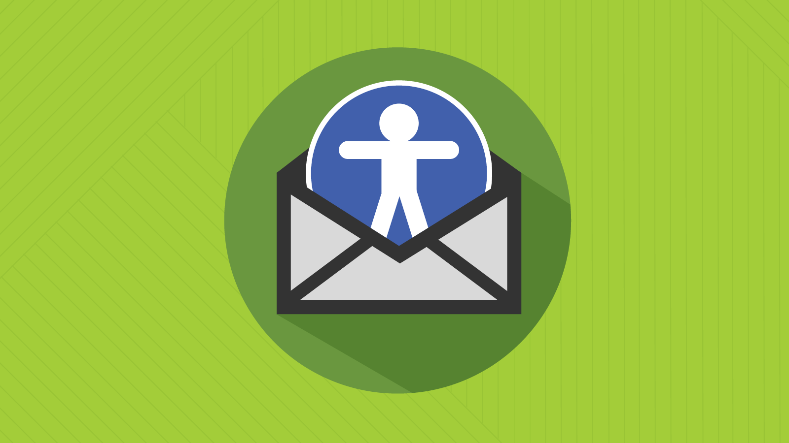
Optimize Your Email Design for Accessibility
Let’s split accessibility email optimization into three key areas: text, colors, and imagery. It’s worth noting that a decent email builder is sure to make things easier as it already comes with dozens (or even hundreds) of templates optimized for accessibility.
Optimize Text
First, optimize the design of text in your emails, as this helps people with dyslexia, poor vision, or those who utilize screen readers. How do you do this?
- Don’t use all caps. It can confuse people with dyslexia. Screen readers are likely to read all caps like abbreviations.
- Make sure to have punctuation marks in place. Put them at the end of your headings and bullets.
- Reduce the reliance on bold and italics for emphasis. Completely ditch bold italics.
- Underline text when it’s a hyperlink. In all other cases, don’t underline it.
- 16 px is an excellent choice for a body text size. It’s perfect for readability.
- Use accessible fonts kike Comic Sans, OpenDyslexic, and various sans serif fonts (Arial, Tahoma, Verdana, Open Sans, Calibri, Trebuchet, and Century Gothic).
- Get your email copy aligned to the left. Don’t justify or add line breaks.
Work with Colors
Alright, now it’s time to make your colors right for people with dyslexia, poor vision, and color blindness. How do you do this?
- Make sure there’s enough color contrast between images and text.
- Go for single-color backgrounds.
- Don’t use sharp black text on bright white backgrounds. Instead, opt for dark gray texts against off-white backgrounds.
- Don’t use color alone to emphasize important info in your emails.
Optimize Your Imagery
Okay, now let’s get down to making images easy to see for people with photosensitive epilepsy, color blindness, dyslexia, and poor vision. How?
- Choose GIFs with fewer flashes/second.
- Use just 1 GIF or animated image per screen.
- Maintain appropriate color contrast, as we mentioned before.
- Add meaningful alt text for all your images. For GIFs that accompany important info or instructions, provide descriptions below.
Write an Accessible Email Copy
Now, it’s time to focus on your email copy and make it readable for people with Visual, cognitive, neurological, and learning disabilities. Here’s how you make accessible emails with your copy.
- Keep your copy short. Don’t make your recipients read lengthy texts. Write a concise copy that quickly drives your point home.
- Keep your copy simple. Use easy-to-understand words. Aim at a copy for an 8th grader. Forget about fancy academic terms and complex jargon.
- Make the line spacing 150%.
- Use subheadings to break your text into easy-to-digest sections.
- Format your headings. Don’t just use larger fonts.
Code accessible emails
Of course, your subscribers cannot view the code. However, optimized code helps to make your emails more accessible. Some of the techniques mentioned for making design accessible depend on accessible coding. Developers might have to integrate inline CSS styling to guarantee a minimum font size of 16 px.
Here’s a note. Using em units for font size in coding is better due to their flexibility compared to px. Pixels are stationary, whereas em is proportionate.
A great way to begin accessible email development is to ensure alt text is included for images and create bulletproof buttons with live text. Both of those actions will enhance the email experience for individuals who utilize screen readers.
Use h-tags like <h1>, <h2>, <h3>, etc. to mark headings in your emails. They are sure to help your subscribers use assistive technology when they want to skip between sections.
Final Thoughts
The tips we’ve shared with you so far will help you meet email accessibility standards and make your emails easier to read for people with different challenges. You need to focus on several key things here. Optimize your texts, colors, and imagery. Create an accessible email code.
